ABOUT
the Company
Sanlien Technology specializes in industrial automation, environmental monitoring, and safety systems, providing solutions for critical infrastructure projects across Taiwan and internationally. Their client base includes project managers, technical buyers, and investors who rely on precise product information to make informed decisions.
the Project
During my time at Sanlien Technology, I had the opportunity to redesign the product page of the Mandarin website. This project aimed to enhance the user experience and improve overall site performance, ensuring that key product information was effectively communicated to users.
the Constraints
Engineering Resources: The engineering team was already heavily involved in other projects, limiting their availability for website development.
the Detail
Duration: 2 months
Role: UX designer & Marketing Specialist
Tools Used: Figma & WordPress
STATEMENTS
the Problem
Disorganized content that made navigation difficult for users.
Inconsistent design elements that hindered brand identity.
Slow loading speeds that negatively impacted user engagement and lead generation.
the Goal
Create a visually appealing and user-friendly product page.
Establish a consistent brand identity and style.
Improve website performance and loading speed.
Organize and streamline product information.
Enhance lead generation and conversion rates.
DESIGN PROCESS
Research & Analysis
User Interviews
Conducted interviews with internal stakeholders to understand the most important product information for customers and identify information gaps.
Which product features do you believe are the most important to highlight on the product page?
What’s the key information that potential customers look for when visiting our product page?
Can you describe any specific challenges you’ve noticed customers face while navigating the website?
Competitive Analysis
Evaluated the websites of competing B2B companies to identify best practices and industry standards.


Heuristic Evaluation
Assessed the existing website using usability heuristics to identify potential usability issues.
Key Findings
Users struggled to find specific information.
The website's visual design and product information were outdated and lacked consistency.
The website's performance was slow, impacting user satisfaction.
The content was disorganized and difficult to navigate.
The existing product page was cluttered and difficult to understand, making it challenging for customers to find the information they needed.
Persona

Emily Chen
Age: 35
Emily works for a mid-sized manufacturing company and is responsible for sourcing new industrial products. She’s relatively new to her role and relies on the company’s website to evaluate potential solutions quickly. She often uses B2B websites to gather technical information but can be overwhelmed by overly complex product pages.
FRUSTRATIONS
Disorganized product information that’s difficult to navigate.
Slow website performance, making it hard to browse multiple pages efficiently.
Product pages cluttered with too much technical jargon or irrelevant details.
GOALS
Find key product specifications quickly and easily.
Understand the benefits and features of the products without needing deep technical expertise.
Compare similar products for informed decision-making.
As a Project Manager at a manufacturing company, Emily wants to quickly find and compare key product specifications on the website, so that she can make informed decisions about sourcing industrial products without getting overwhelmed by technical jargon.
REDESIGN IMPLEMENTATION
Before

After

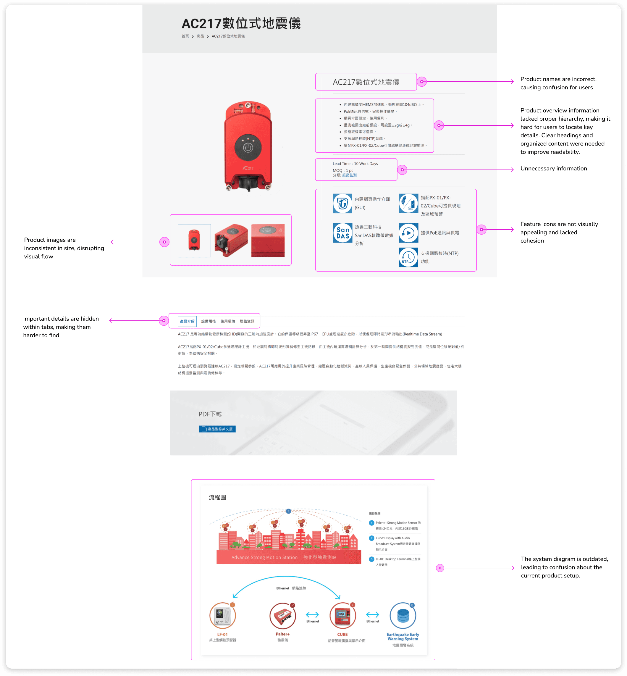
Consistency in Product Naming
One of the challenges we faced was inconsistency in product naming. The previous naming system was disorganized, causing confusion among users. To address this, we unified the product names by placing the new name first, followed by the old name in parentheses. This ensured that users could easily find the products they were looking for, regardless of the terminology they were familiar with.
Consistency Product Image
Product images are now consistent in size, creating a more uniform layout. This consistency helps reduce cognitive load as users browse the page, making it easier to compare products visually without being distracted by size differences, ensuring a smoother user experience.
Clean White Background for Clear Visuals
By using a clean white background, the product images and icons stand out, creating a clear distinction between important content and the background. This ensures that users’ attention is drawn to key information, like the product and feature icons.
Visual Hierarchy in Product Overview
In the redesigned product overview, information is now organized with a clear introduction followed by bullet points. This structure establishes a clear visual hierarchy, making it easier for users to scan and digest key product details at a glance, guiding them from the most general to specific information.
Icon Redesign
The feature icons have been redesigned to have a consistent style, size, and color. This allows users to quickly recognize these visual elements as related to product features, enhancing comprehension and making the page feel more cohesive.
Before

After

Product Specifications and Comparison Table
Product specifications were made easier to access without excessive clicks, and a comparison table was introduced to allow users to compare similar products side-by-side. This improves decision-making by presenting key product features clearly and in a structured manner.
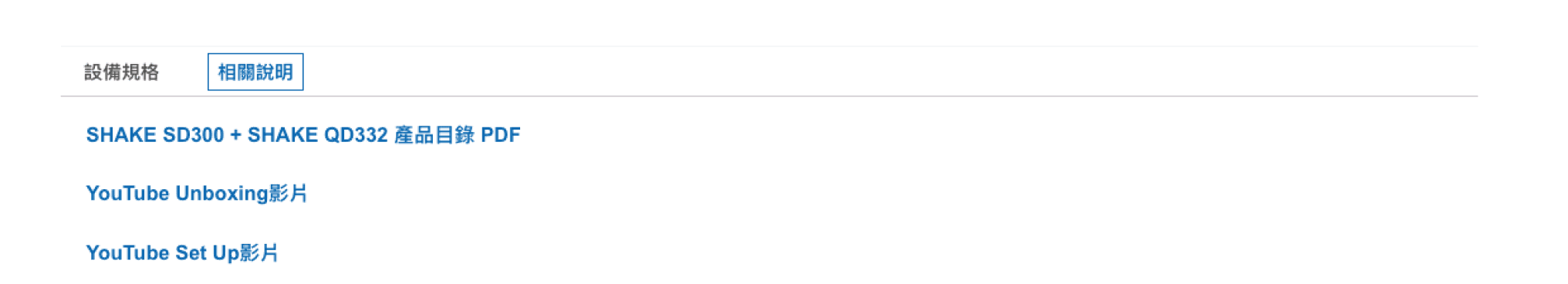
Grouped Related Content
Product datasheets, unboxing videos, and other related resources were grouped under one tab. This organization reduces clutter and allows users to find all relevant materials in one place, improving the overall user experience.
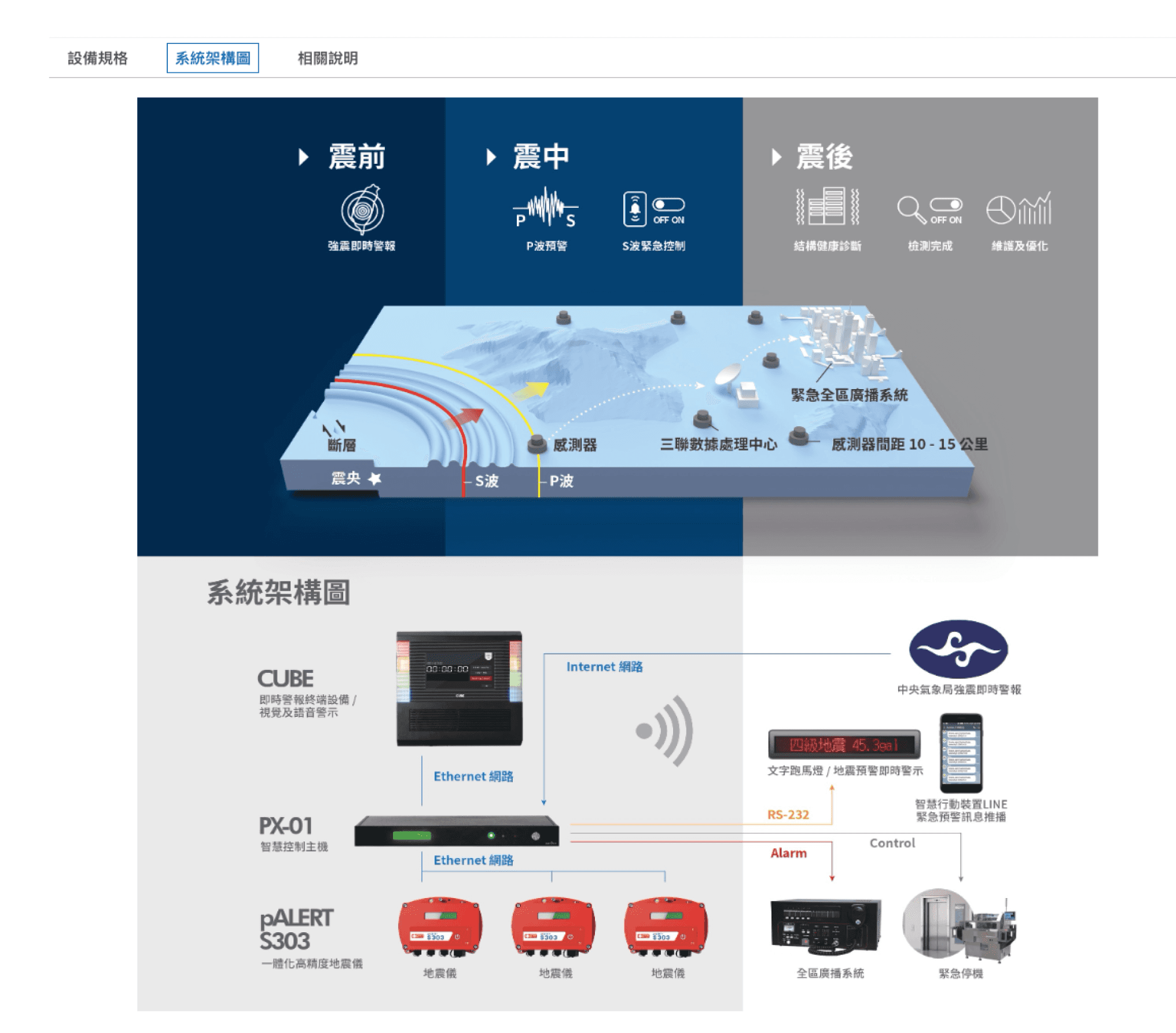
Updated System Diagram
The outdated system diagram was replaced with a newly designed version. The new diagram is clearer and provides a more accurate representation of the product’s current functionality and connections, making it easier for users to understand the product’s operational flow.
Improved Database Performance
The WordPress database was overloaded and unorganized, which contributed to slow page loading speeds. To address this, the database was optimized by organizing content and removing duplicate images. This resulted in a faster, more efficient website, improving the user experience and reducing frustration caused by long load times.
RESULTS & IMPACT
Improved Lead Generation
The redesigned website provided clearer information and relevant keywords, making it easier for customers to express their needs and initiate contact.
Reduced Sales Inquiries
The redesign decreased the number of sales inquiries that required clarification, leading to improved customer satisfaction and reduced workload for the sales team.
Increased Website Performance
Page loading times were reduced by 30%, leading to a faster and smoother browsing experience.
Enhanced User Experience
The redesigned website received positive feedback from users, with improved satisfaction and engagement
Increased Conversion Rate
The improved user experience and clearer information resulted in a higher percentage of website visitors taking action, such as contacting the company.
Improved Information Accessibility
The reorganized content made it easier for users to find the information they needed.
CONCLUSION
The redesign of Sanlien Technology’s Mandarin website successfully addressed the existing challenges and provided a more effective and user-friendly experience, despite the constraints of limited engineering resources. By applying design principles, conducting thorough research, and implementing technical improvements, the project achieved its goals of enhancing brand identity, improving website performance, streamlining product information, and increasing lead generation.
This project was also my first venture into the field of UX design. It sparked my passion for creating user-centered solutions and deepened my understanding of how design can improve both user experience and business outcomes.
Thanks for exploring
tzuyunluo@gmail.com